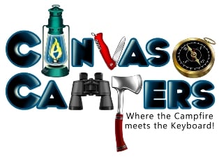
I've had many people compliment our logo and also asked how we came up with it? Here is the evolution.
[smg id=652]
We originally start out with a campfire because it just seemed natural.
[smg id=653]
We then needed to show the website name.
[smg id=654]
It seemed simple and very plain so we wanted to build in camping related items.
[smg id=655]
We added canvas in the background.
[smg id=656]
This was the look when we went live in July 2010
[smg id=657]
Change to a bolder font and created quality images.
[smg id=658]
We added a glow from the lantern on each letter. The first C glows on the right side and all the others on the left.
[smg id=659]
We opened up the center of the letters (A, S, E and R) for nicer and cleaner look. This is what is printed and used today.
[smg id=670]
The winter snow cap logo used December 2011 - March 2012.
1134
153
1 Guest(s)

